A premium logo must work at small sizes
If the logo only looks good on Instagram but fails on a favicon or a stamp, it isn't production-ready. Test it small, in one color, on dark and light backgrounds before approving it.
Typography is the most common problem
Most cheap-looking logos fail because of typography and spacing, not because the idea is weak.
- Avoid overly decorative fonts for serious businesses.
- Refine letter spacing and alignment.
- One strong type choice beats three decorative ones.
Build a logo system, not one file
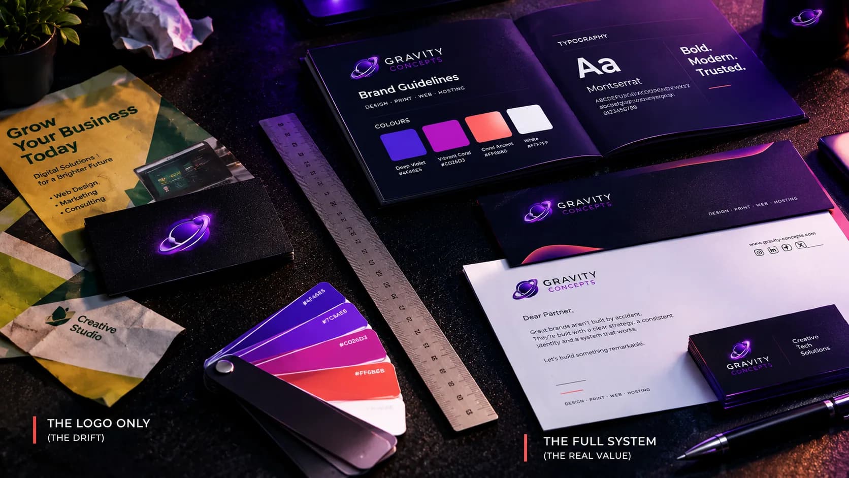
Professional brands deliver multiple versions designed for real usage:
- Primary logo
- Icon-only mark
- Horizontal lockup
- Single-color version for emboss, stamps, and favicons
Frequently asked
How do I test whether my logo is production-ready?
Shrink it to favicon size, remove color, and place it on both a dark and a light background. If it still reads clearly, it's ready.
Should I have more than one version of my logo?
Yes. A primary lockup, an icon-only mark, a horizontal version, and a single-color version cover almost every real-world use.
Ifeanyi Ejidike
Creative Director & Lead Engineer, Gravity Concepts
Writes from real client work — branding, print, and production-grade web builds for ambitious businesses.
Want us to handle this for you?
Design, print, web builds, and ongoing maintenance — fast response, direct communication.