
Bloom Cosmetics
A complete beauty-brand identity and packaging direction built for consistency across product and promotional use.
Project overview
Bloom Cosmetics was created as a branding system that feels soft, premium, and market-ready. The project focused on packaging direction, logo application, and an identity that can remain consistent across print and digital touchpoints.
Challenge
The brand needed to feel premium and cohesive while still being flexible enough for packaging and promotional use.
Solution
A visual identity system with aligned packaging direction, controlled typography, and cleaner product presentation was developed.
Outcome
A beauty brand identity built for premium perception and consistent use across packaging and digital visuals.
Stronger premium beauty positioning
Consistent brand application
Packaging-ready visual system
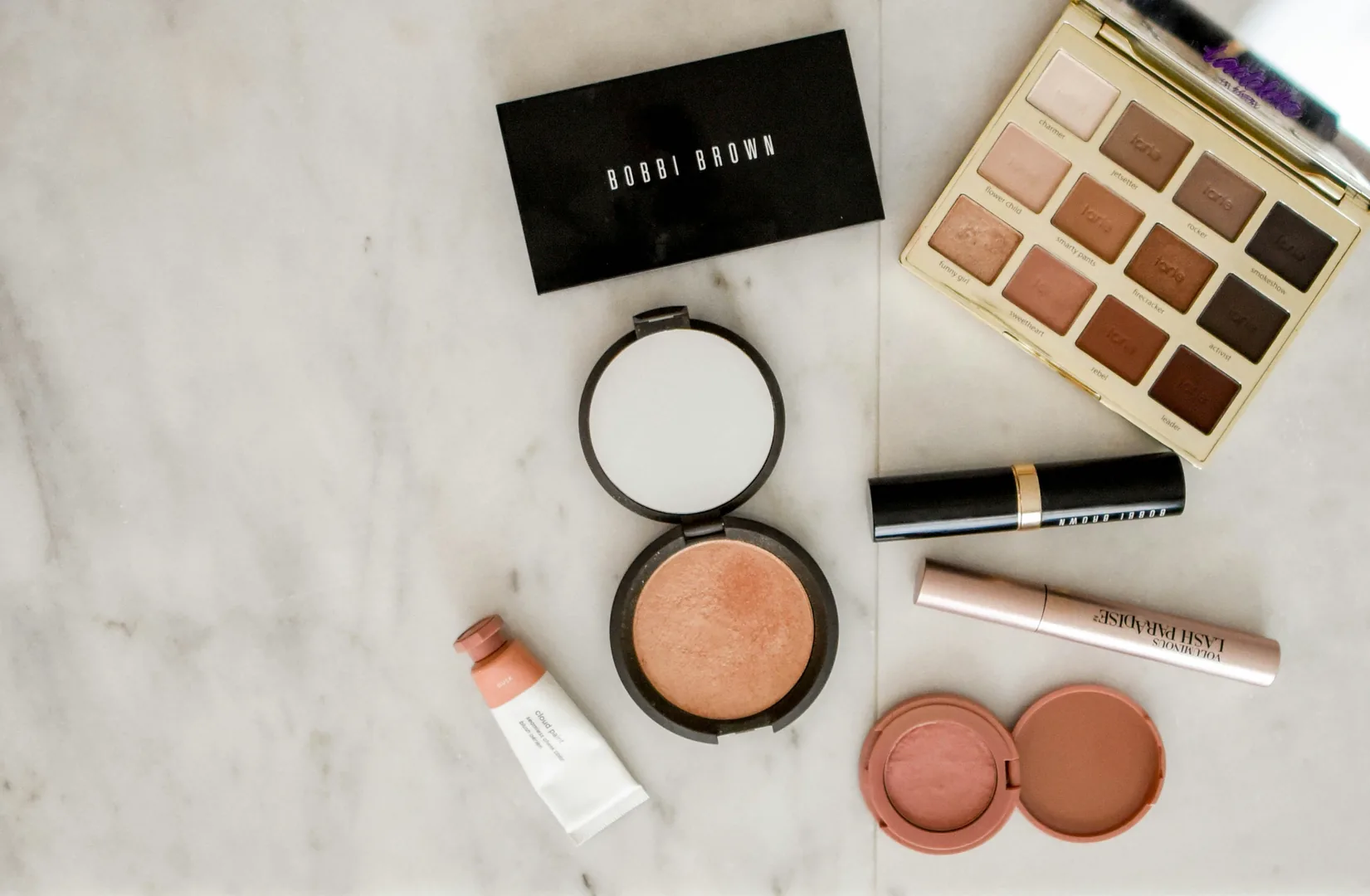
Project gallery
Key screens and visuals from the project.

Services
- Brand identity
- Visual direction
- Packaging design
Deliverables
- Logo suite
- Brand palette + typography
- Packaging-ready files
Need this exact type of work?
Tell us what you’re building and we’ll recommend the best approach for design, print, web, hosting, or maintenance.
Related projects
More work in the same category.
